People basically build a familiarity with products that they get to see frequently and that is why many products are investing a lot of resources in developing a familiar identity of their brand. Even the products that have a somewhat negative impact are considered better than those that have no brand identity. However, logo plays a very significant role in building a strong brand identity and it also market the main features of the product as well. This article is to help business understand how to make a good logo to help them build a stronger brand identity.
There are many factors that make a logo functional and effective for the branding purposes mainly. A business has to first figure out who they are and how exactly are they willing to help their customers have a better life. Designing a logo needs a business to take care of a number of major aspects such as the color combination, font style, and so on. The article is going to mention all the handy logo design tips to guide the businesses. Lets start with the one of the finest advices that you need for designing perfect logos for your business.
Research
Research is the best way to start your journey of designing a logo. That is because a researches lets you have an idea about what you are expected to do in order to have an excellent logo for your brand. First, get to know about each of the elements of a logo and then formulate a design that would represent your brand in the most effective and appealing manner. Here are some useful details about the features of a logo along with the logo design tips to make you understand things on a deeper level.
Colors that You Should Choose
Color psychology is a subject that tells about the meaning of colors and their specific importance in branding. A designer needs to explore this subject for understanding what a particular brand require. However, here is an overview of the characteristics of a few major colors that brands consider.
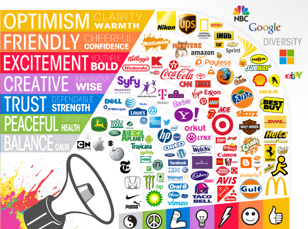
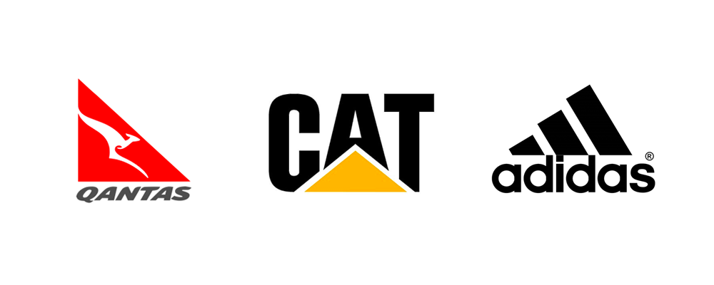
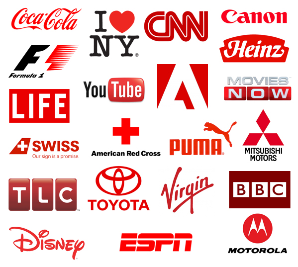
Red
Red is one of the most common color that brands use for logo. There are a number of shades of red that are used in logo designing. However, no matter which shade, red is a memorable color that has a sharpness for inviting every passerby to have a look. It does not only grab the attention, but it also holds it for long in order to ensure that the logo has been imprinted in the viewers’ mind.
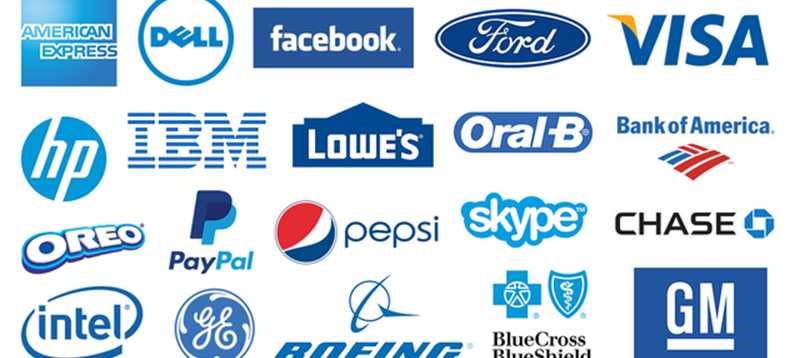
Blue
Blue is also one of the favorite color of marketers and logo designers. It has a strong impact on the viewers because of the stability that this color contains. Blue is the color of calmness, professionalism, strength, expansiveness, and wisdom.
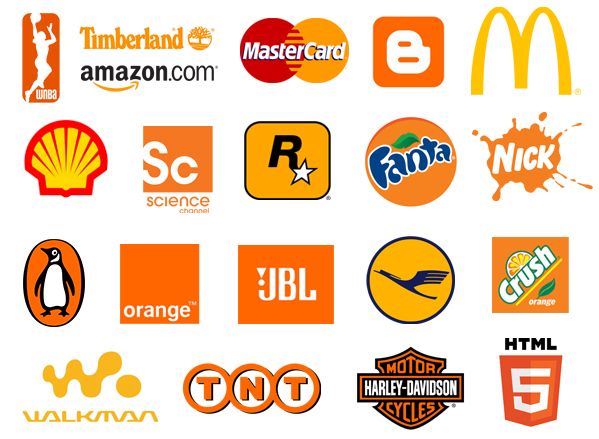
Yellow
Yellow is the color that can represent youth, glow, enlightenment, energy, and cowardice as well. The color is definitely not suitable for every brand. Many designs do not include yellow in their color related tips for creating a logo.
Psychology of Fonts
Fonts contribute largely in developing a certain brand identity or image. You can use a particular font for your logo in order to define the major values of your brand. For instance, using an old font with archaic characters will make the audience assume your brand somehow related to old age brands. They may think that you are old fashioned or they can also perceive that you are a well-established brand. It depends on the other factors and the product you sell which attribute will have a dominant presence. In either case, it is quite clear that font plays a significant role in establishing a brand image.
Use of Basic Shapes
The design of a logo is often based on basic geometrical shapes. Sometimes, the name of the brand is also used to form a certain shape. If you have been thinking about how to come up with a logo that has one of these shapes you should know that just like other elements of the logo, different shapes also have different significance. Circle represents different ideas and square comprises different wisdom. So before you make any choice know the meaning of each of these shapes. Here is a brief overview for the readers to understand the influence of some basic shapes.
Square
Square has a firm, concrete impact that implicates stability, strength, and structurally organized pattern. The shape is quite rich in meaning and usually have dominance in the design.
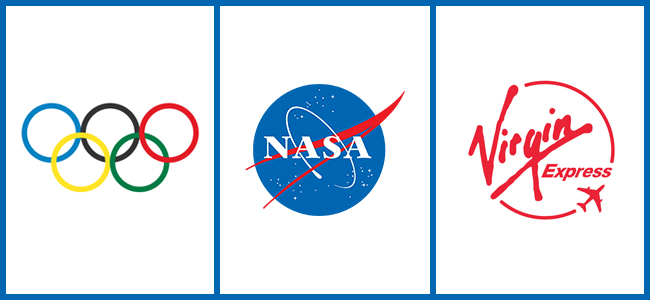
Circle
Circle is a very meaningful geometric shape that can be manipulated to represent two different concepts. First, a circle refers to originality and the beginning because of its association with the earth and other solar planets. On the other hand, a circle signifies movement, growth, progress, and other similar ideas because of its resemblance with a wheel, the first invention of the mankind.
Triangle
Triangle is a shape that emphasis on continuity and consistency yet, the presence of angles in this shape also refer to structural pattern and stability. Furthermore, triangle have been considered a religious connotation by many.